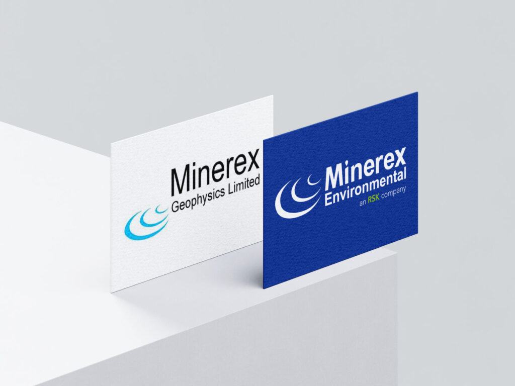
Minerex is a real-client branding project focused on refining an existing visual identity through typographic hierarchy, layout consistency and production-aware design decisions.
Rather than redesigning the brand from scratch, the project concentrates on small, strategic adjustments that improve clarity, coherence and professional perception, while respecting the company’s established identity.
Concept The approach centres on refinement. Typography, spacing and colour balance were carefully adjusted to strengthen readability and structure, allowing the brand to communicate precision, reliability and confidence without losing recognition.
Audience Clients, partners and stakeholders within the environmental and technical sector, where clarity, credibility and visual order are essential for trust and communication.
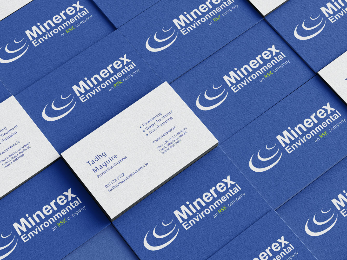
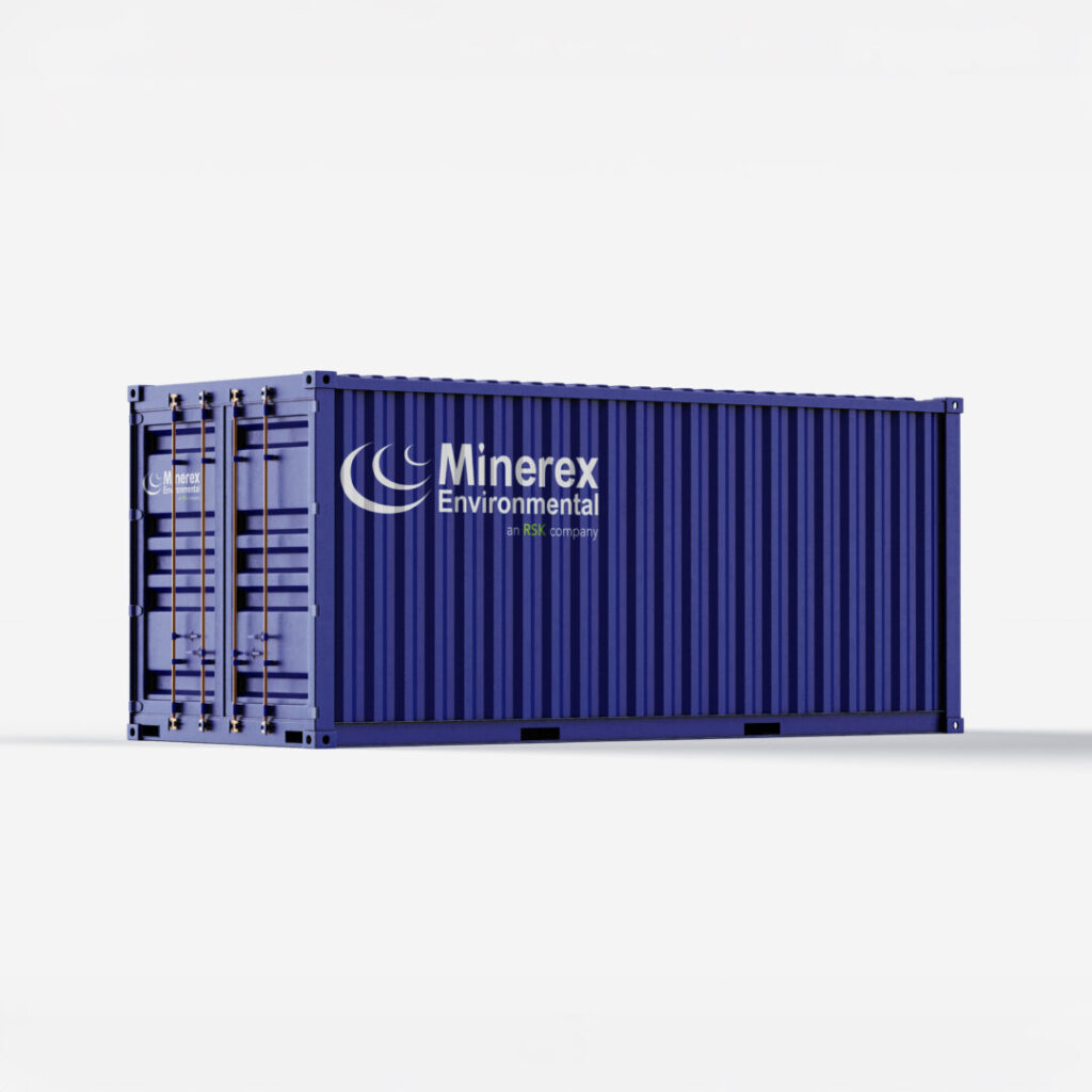
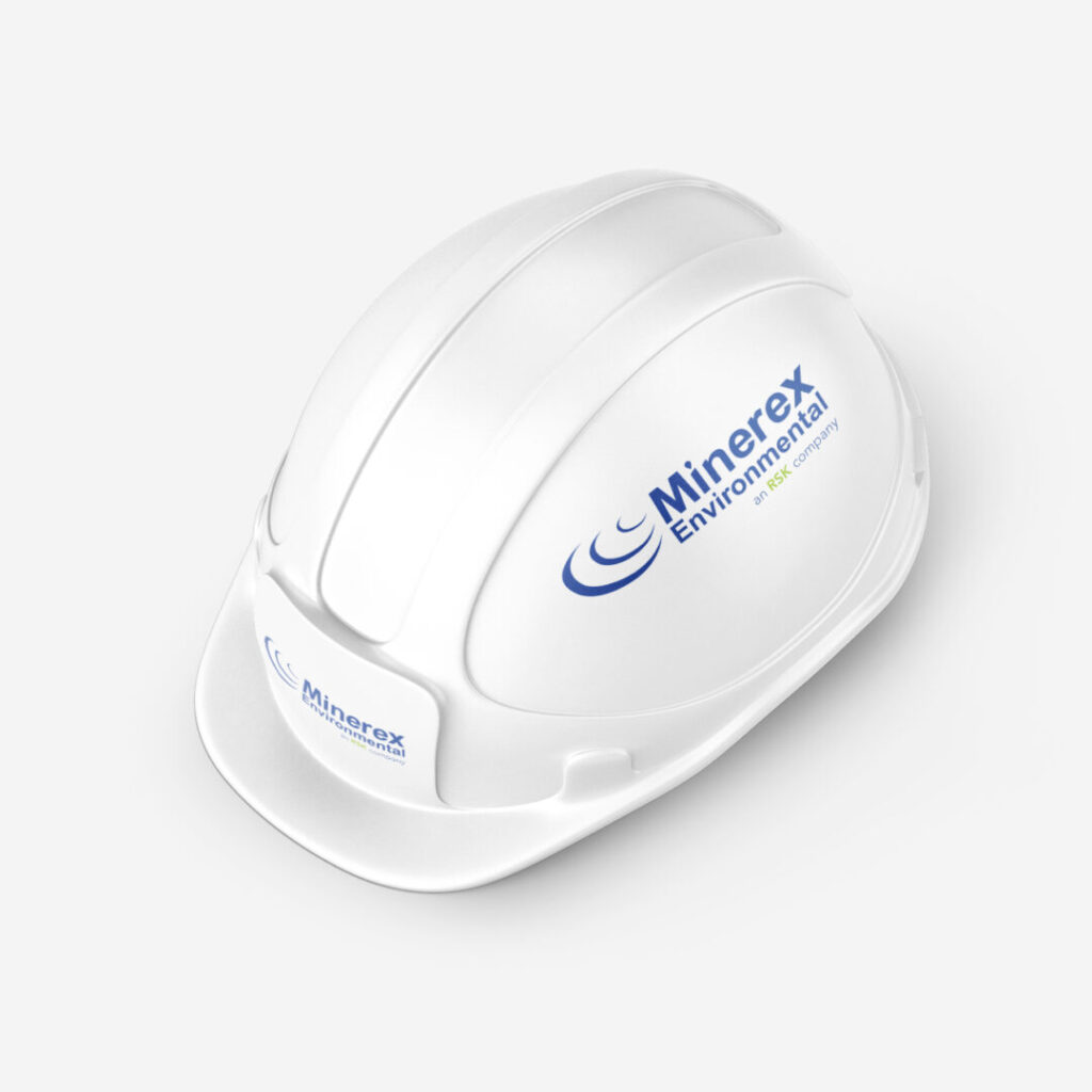
Outcome The final system includes refined logo applications and a business card design built around a clear typographic hierarchy and consistent layout logic.
The project demonstrates my approach to strategic branding, attention to detail and production-ready design, translating conceptual decisions into practical, real-world applications.