Philosophy Collection is a self-initiated editorial design project that explores how complex philosophical ideas can be translated into clear, structured and visually engaging publications, without losing depth or intellectual rigor.
The project focuses on building an editorial system capable of guiding the reader through dense and abstract content, balancing conceptual clarity with visual restraint.
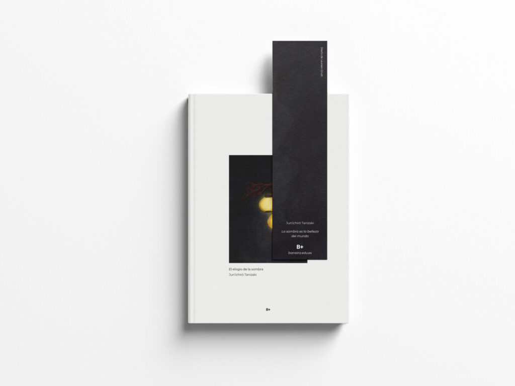
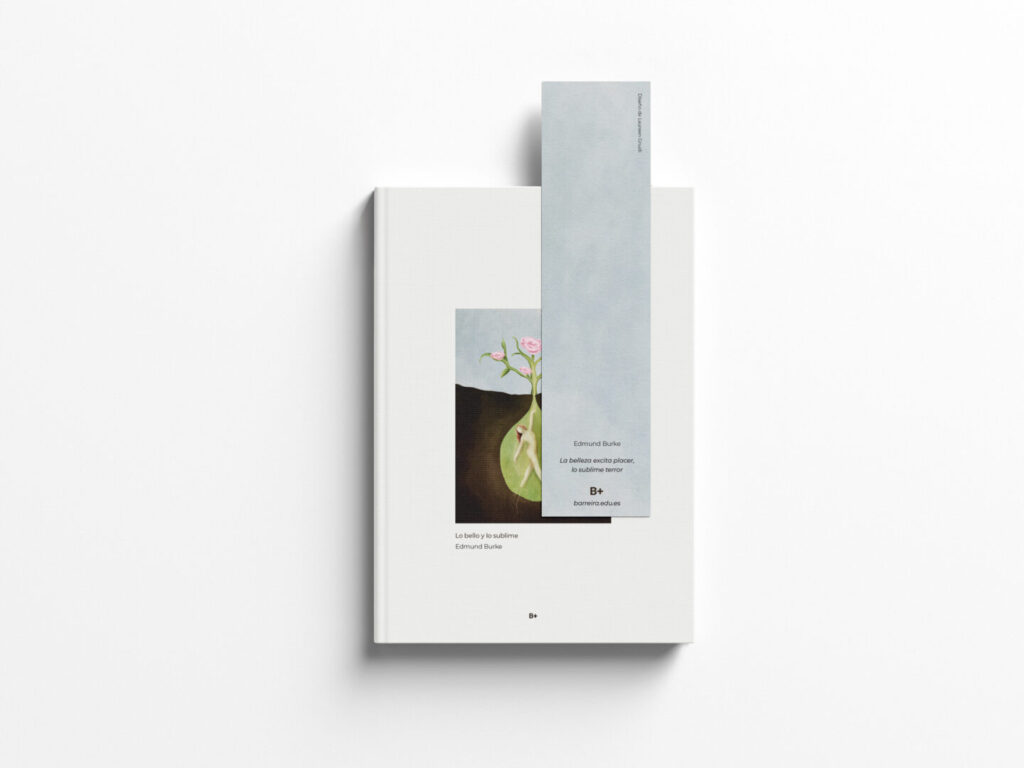
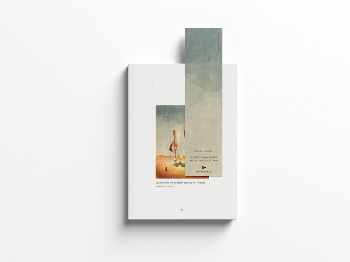
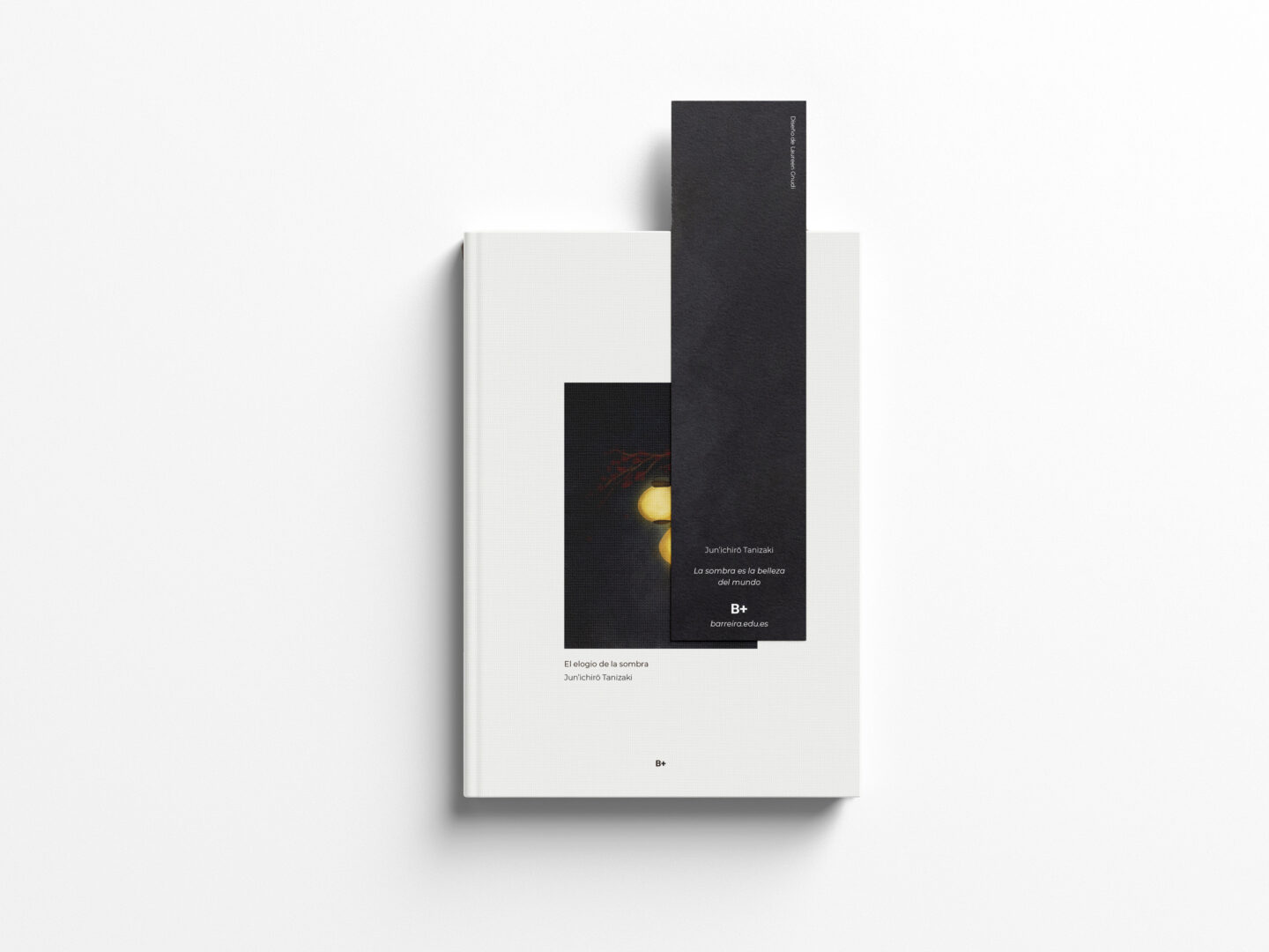
Concept & Editorial System The collection is designed as a three-book series, built around a modular editorial system that combines restrained typography, minimal layouts and expressive illustration.
Each cover follows a consistent structure — a central illustration, a clear typographic hierarchy and a vertical chromatic band — ensuring cohesion across the series while allowing each title to maintain its own identity.
Colour, texture and composition function as interpretative tools, translating philosophical concepts into visual language rather than serving a decorative role.
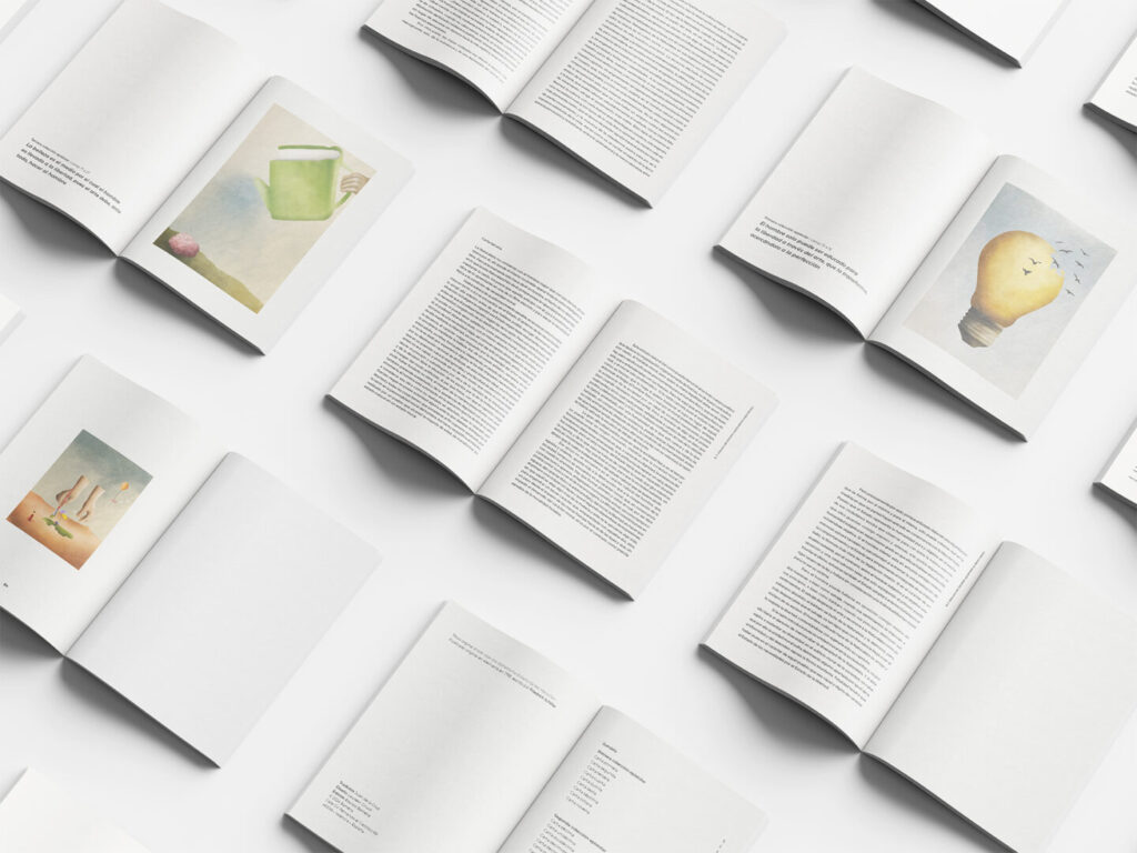
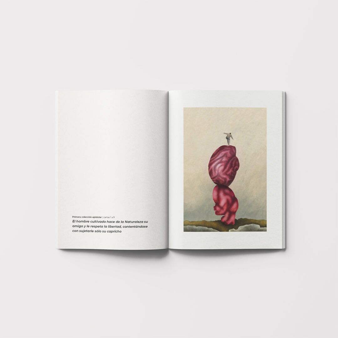
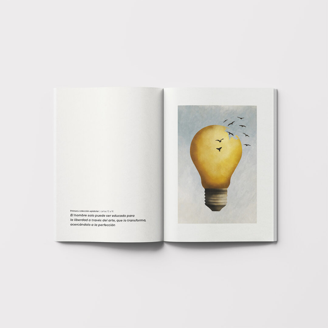
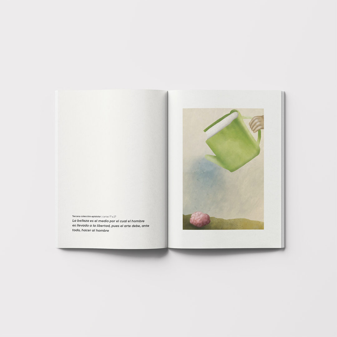
Interior Design The interior of Letters on the Aesthetic Education of Man was fully developed using a contemporary grid system designed to support readability, rhythm and pacing.
Generous margins, a focused typographic hierarchy and clear visual structure help the reader navigate long philosophical passages. Each chapter opens with a custom illustration that interprets key themes through symbolic, slightly surreal imagery.
Outcome The project demonstrates my approach to editorial systems and conceptual design, highlighting the importance of structure, hierarchy and intention when working with complex written content — from grid construction and typography to format and production considerations.