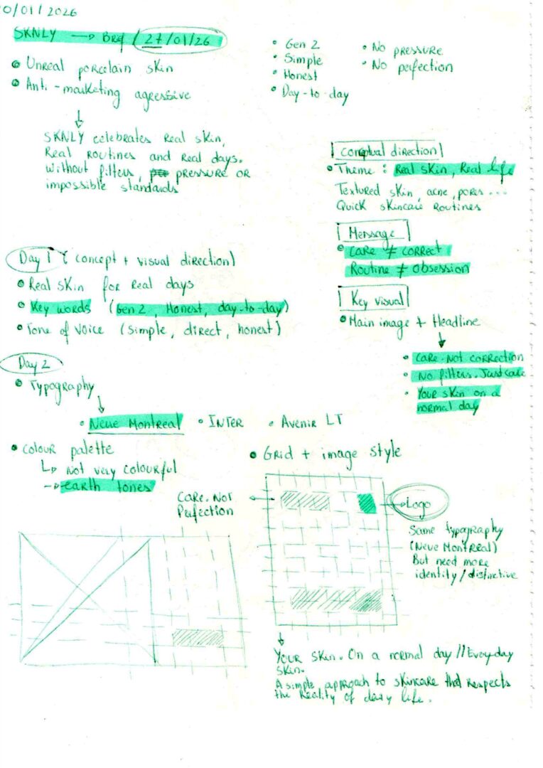
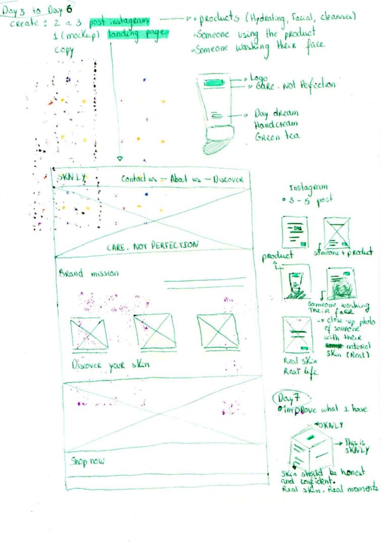
Developed from an open brief shared on Instagram, this 7-day challenge explored the creation of a skincare brand centred around real skin, diversity and self-expression. SKNLY was designed to feel calm and relatable, shifting the focus from perfection to everyday care.
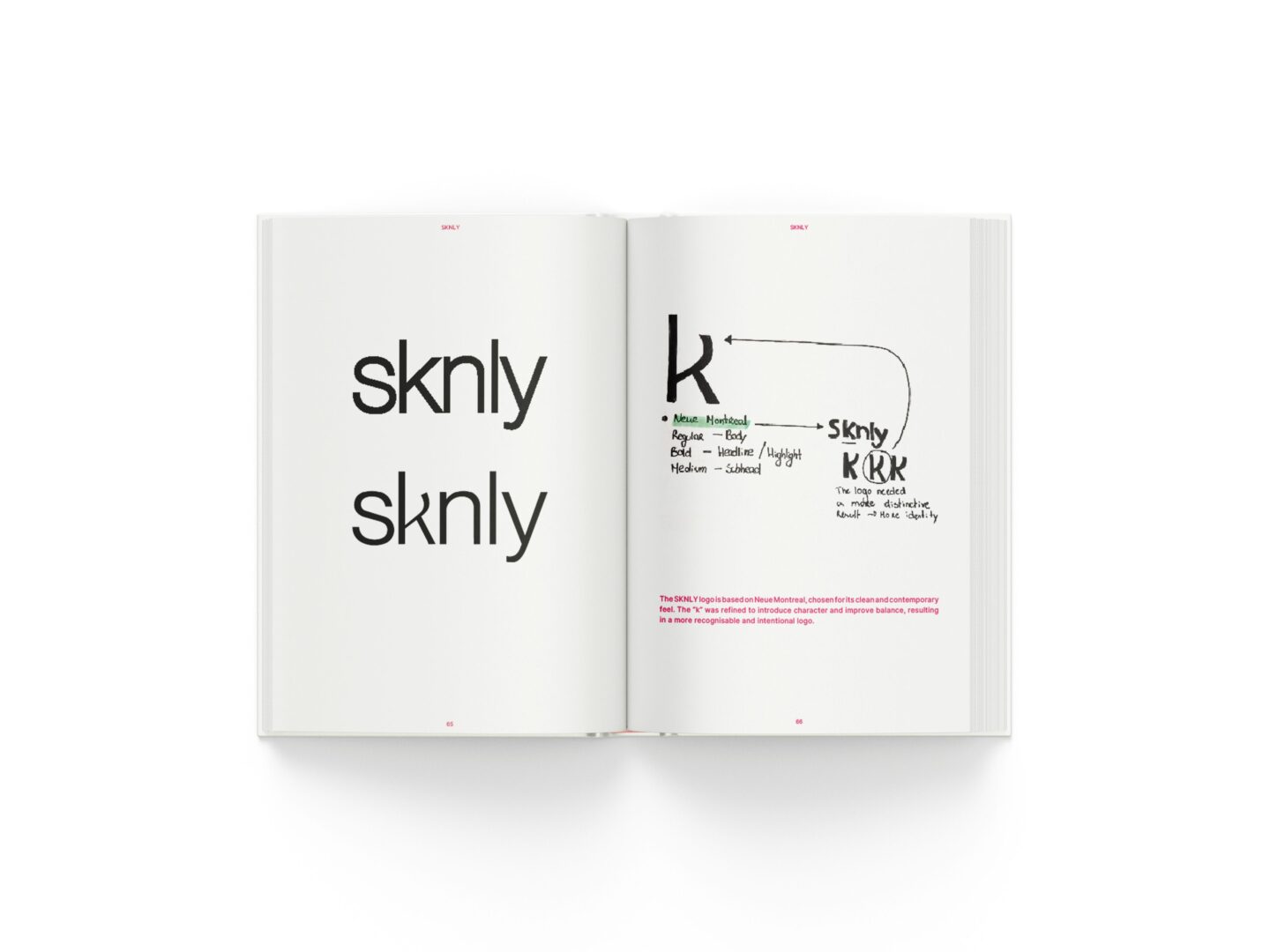
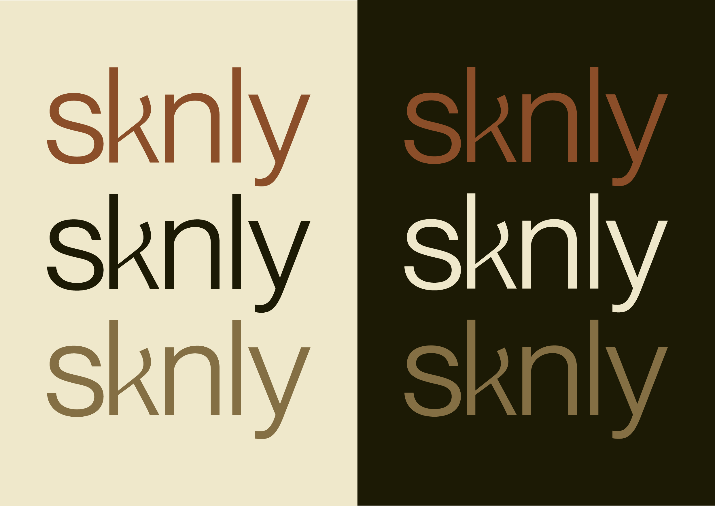
The SKNLY logo is based on Neue Montreal, selected for its contemporary character. The “k” was refined through adjustments to balance, spacing and curvature, creating a more recognisable and intentional identity.
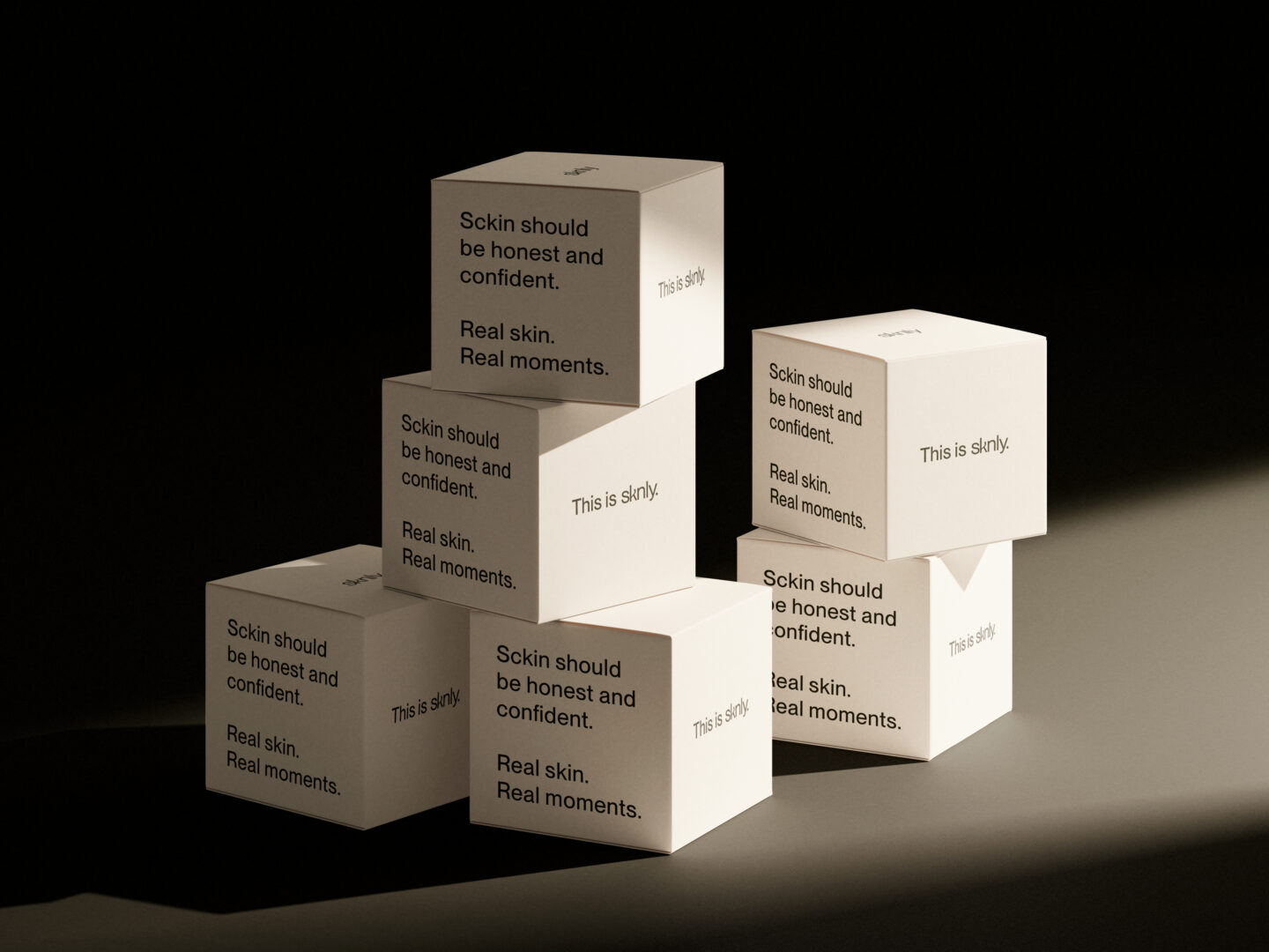
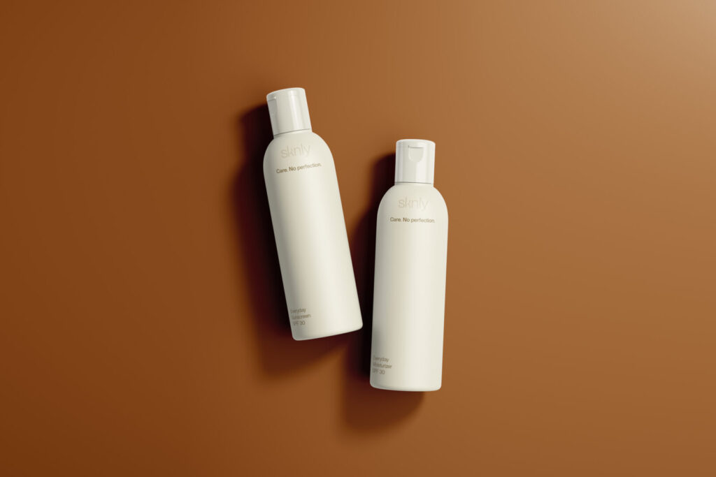
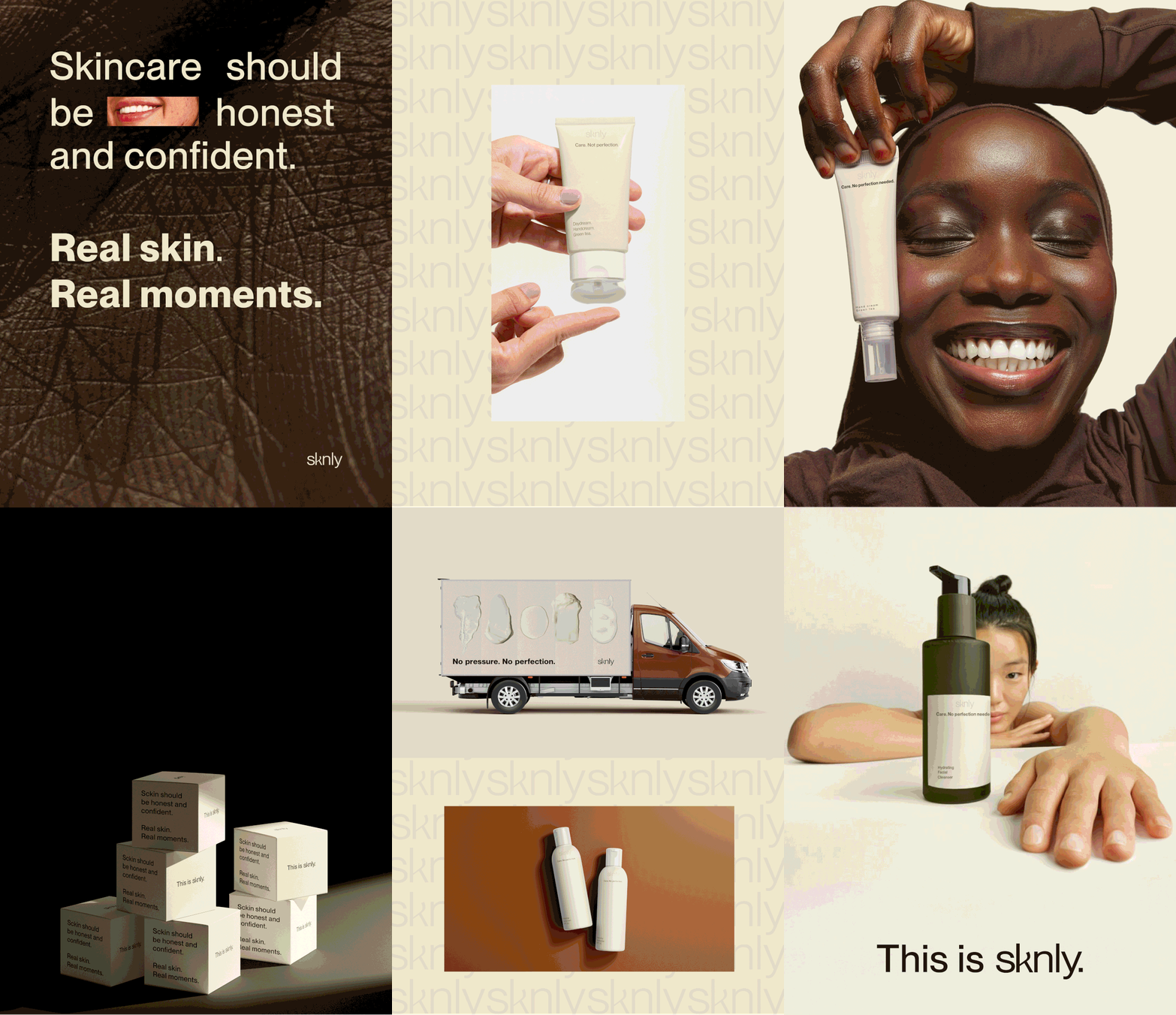
A cohesive packaging system designed to extend SKNLY’s identity across product and transport packaging.
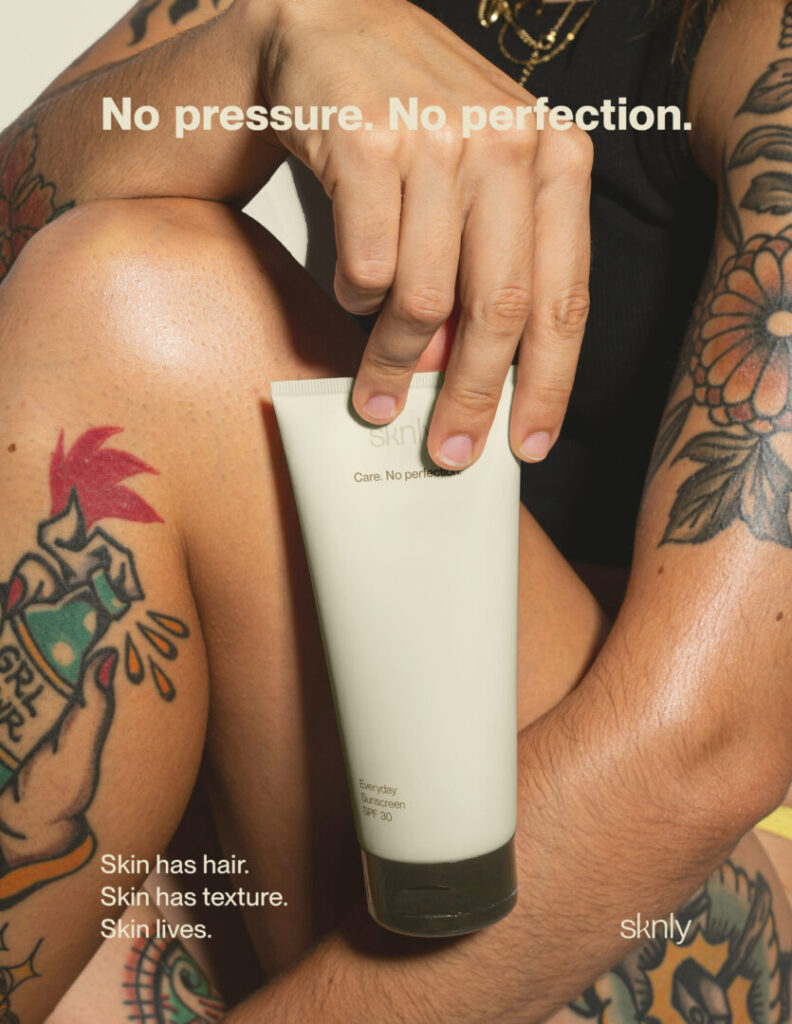
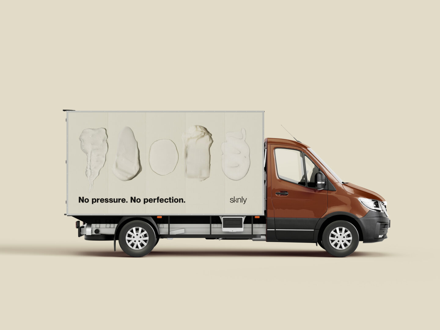
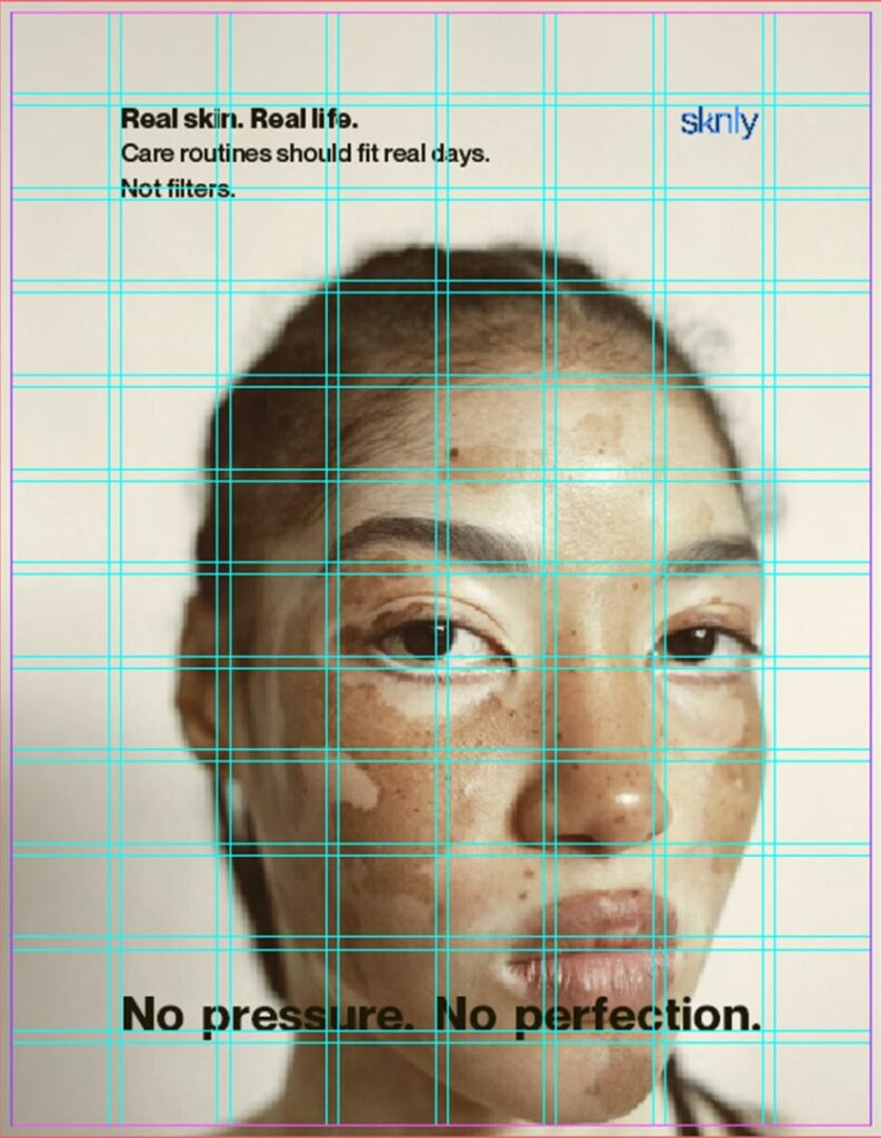
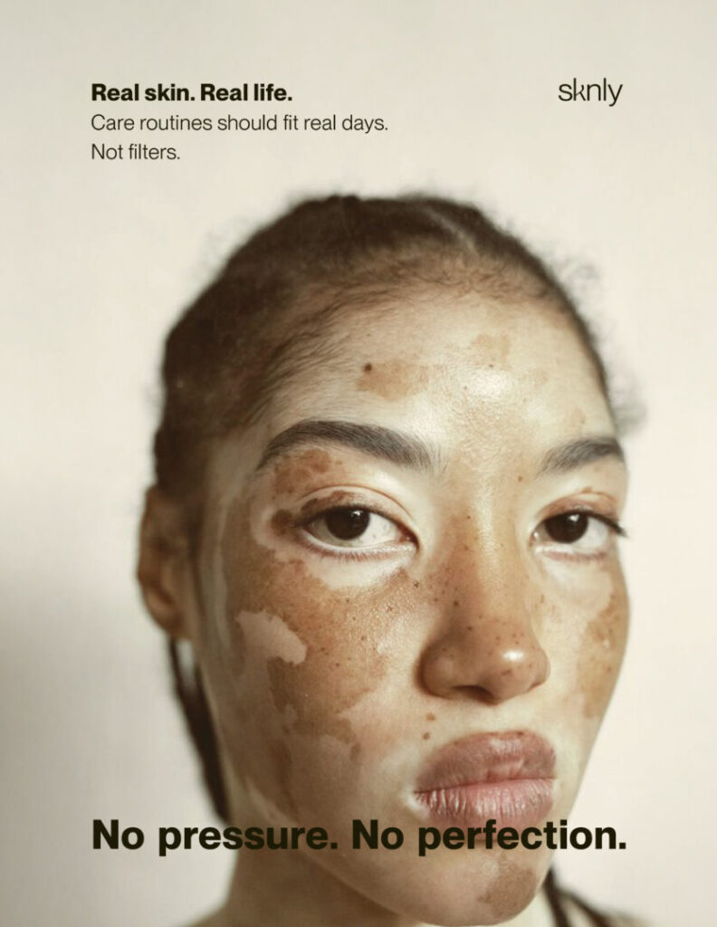
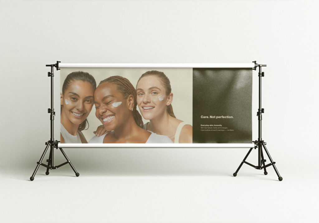
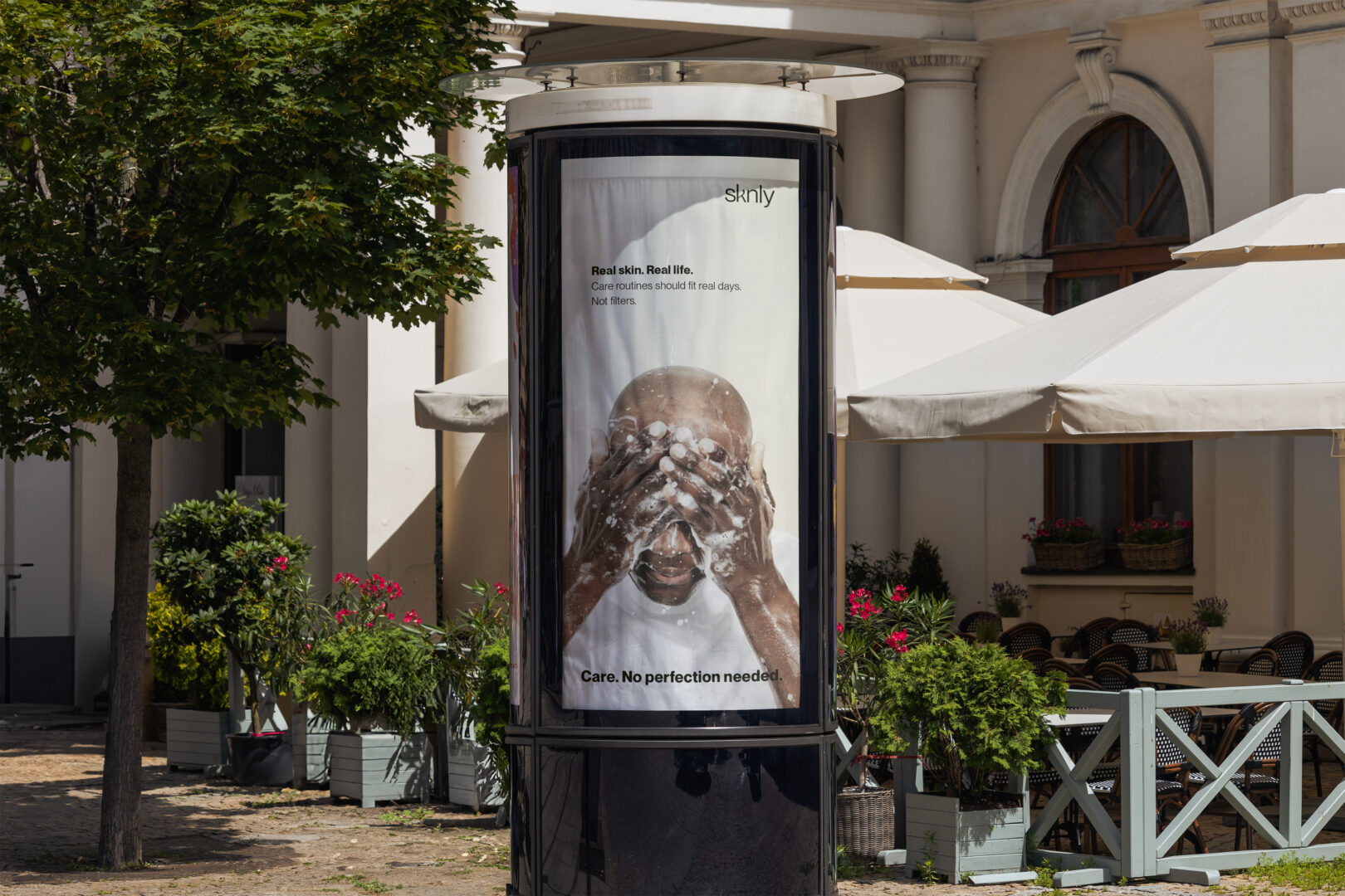
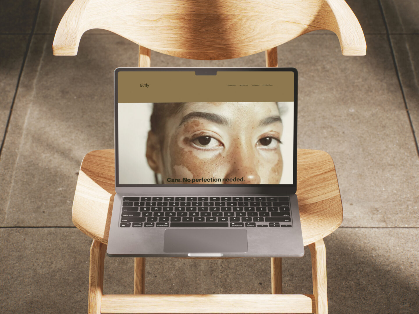
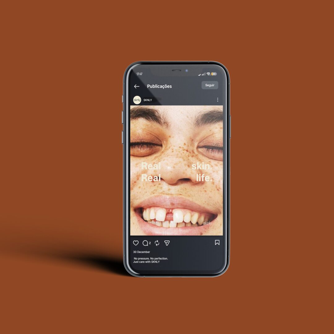
SKNLY’s identity extends across advertising, web and social media through intimate imagery, minimal layouts and image-focused communication, using real skin to create a more relatable connection.
This 7-day challenge strengthened my ability to work quickly while building a clear and consistent visual system under time constraints.