Zeta Beer is a conceptual craft beer brand that explores how playful, illustration-led design can invite people in, creating a relaxed and approachable brand presence rather than an intimidating one.
The project investigates how a visual identity can remain coherent across physical and digital touchpoints, while expressing a contemporary Mediterranean lifestyle aimed at a young, Gen Z audience.
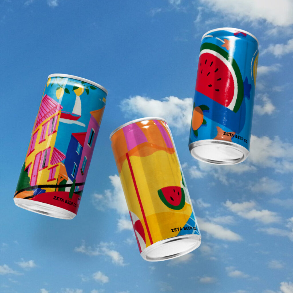
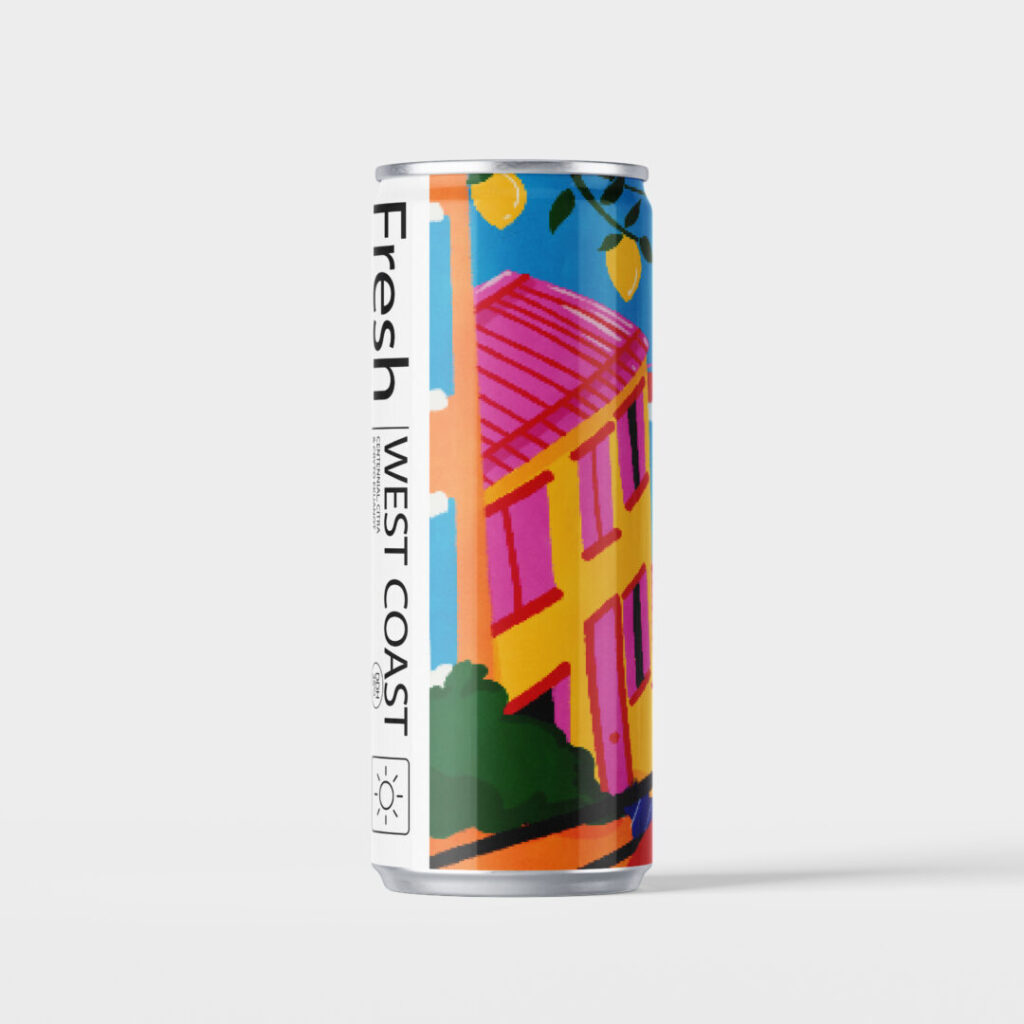
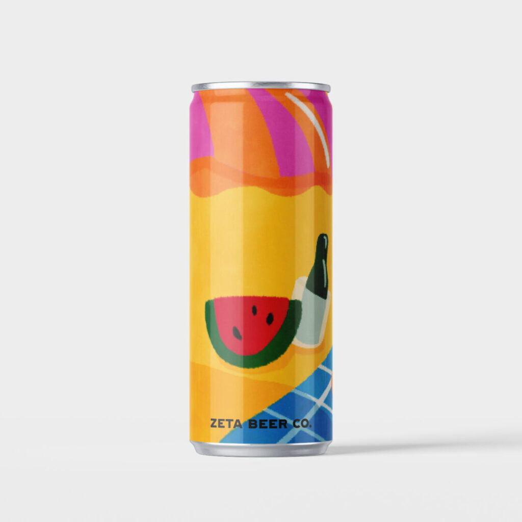
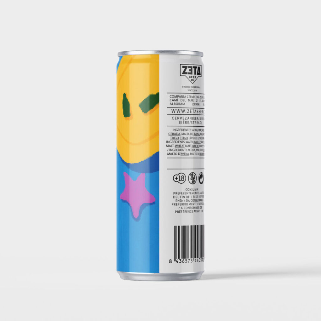
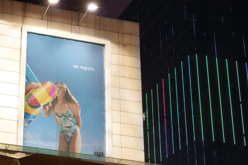
Concept & Visual Approach The identity is built around colour, illustration and storytelling as core branding tools. Three beer labels were developed as part of a cohesive series, each representing a different moment of Mediterranean life — floating fruit in the sea, a coastal town and a laid-back beach scene.
Rather than relying on traditional beer aesthetics, illustration is used to establish atmosphere, emotion and escapism, shaping a brand that feels informal, summery and culturally grounded.
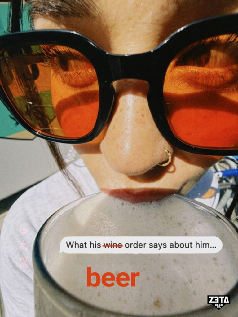
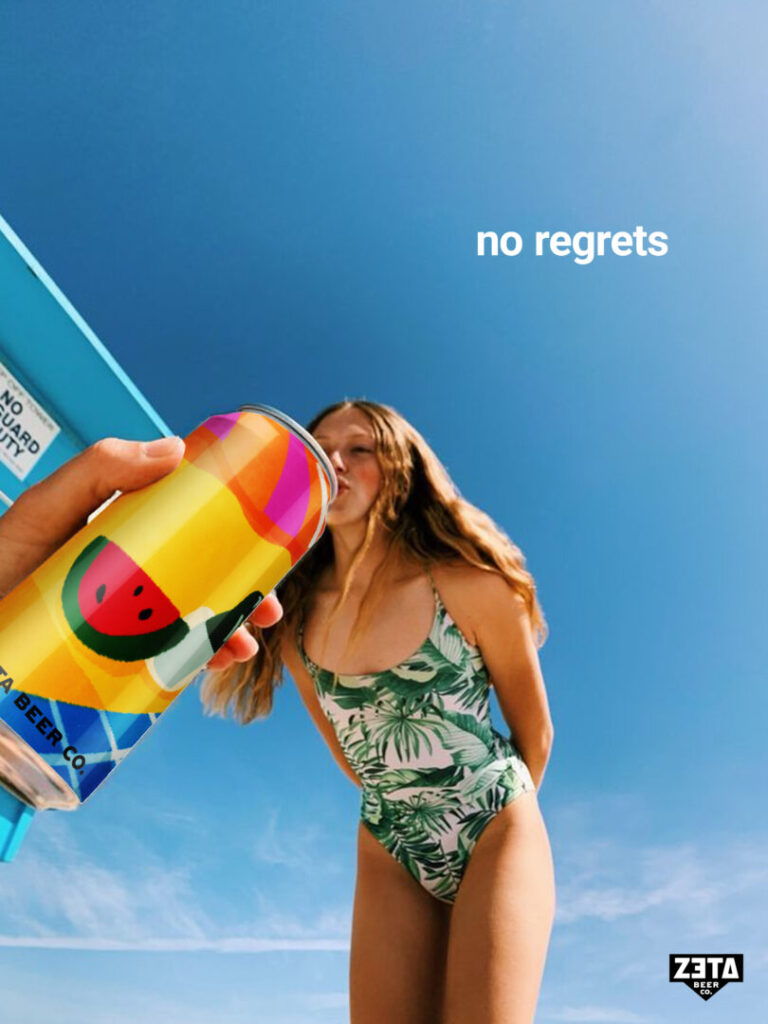
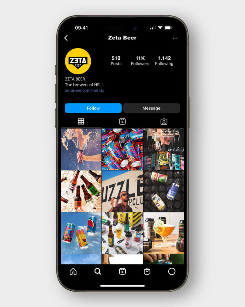
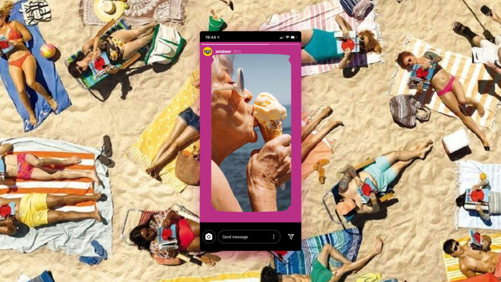
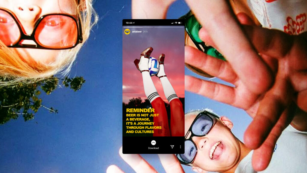
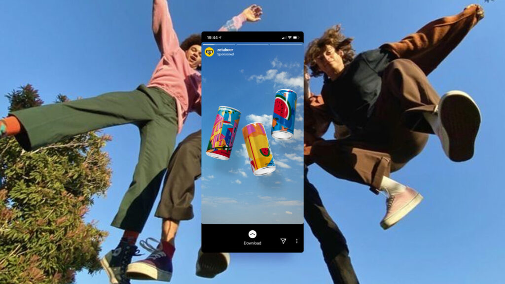
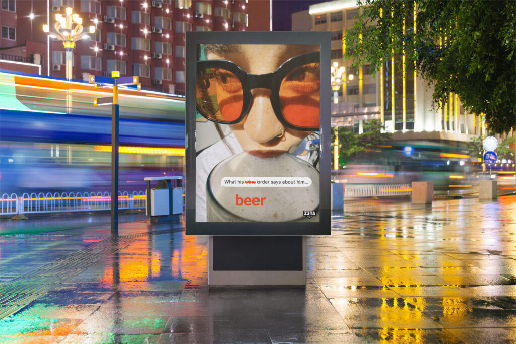
Packaging & Digital Application The visual system was applied to packaging and extended into a social media concept, translating the brand’s playful tone into digital formats. Typography, colour and illustration work together to create content that feels casual, scroll-stopping and consistent across platforms.
Outcome The result is a flexible illustration-led branding system that translates cultural references into a recognisable visual language. The project demonstrates how illustration and colour can function as strategic elements within branding, ensuring clarity, consistency and emotional connection across both physical and digital contexts.