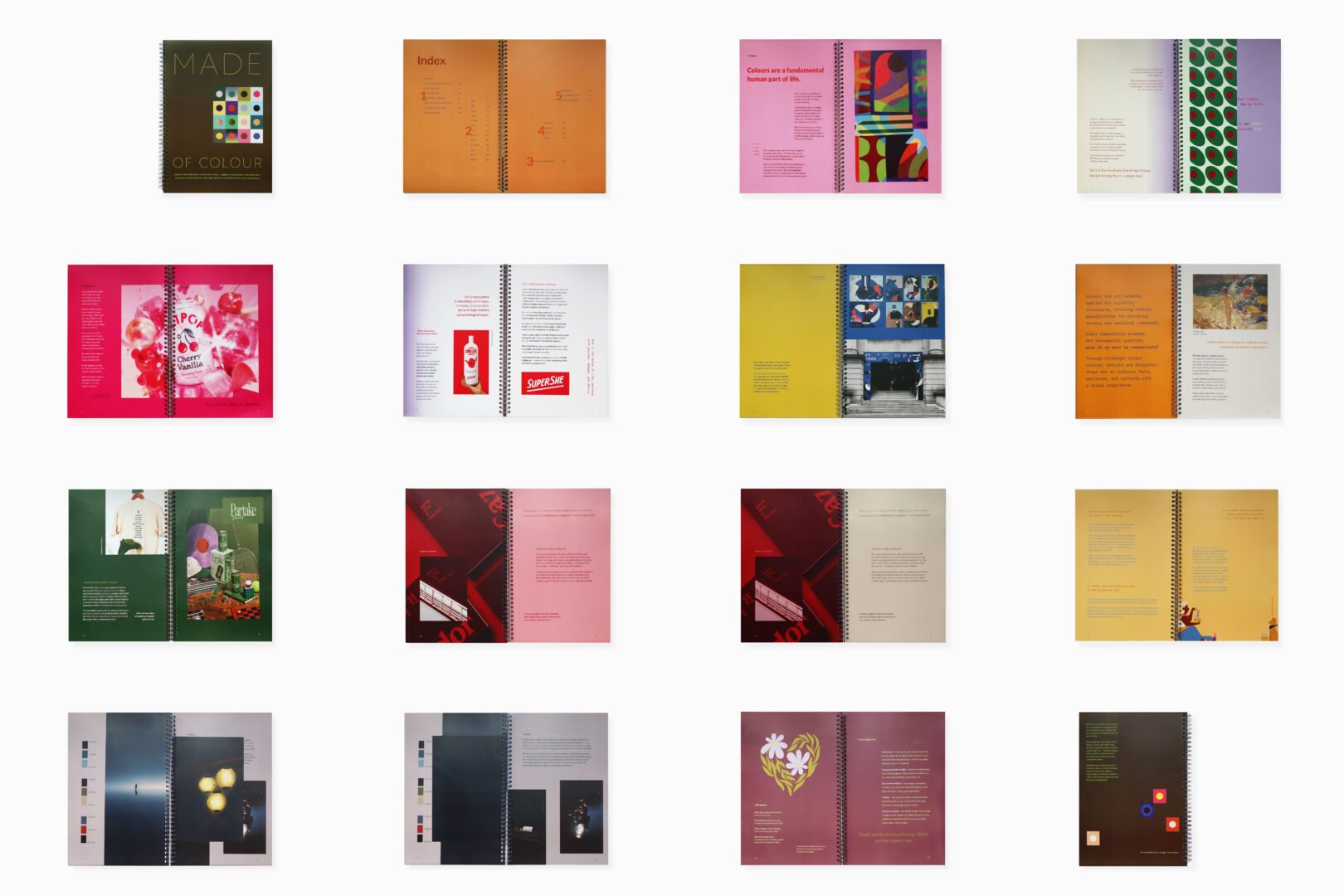
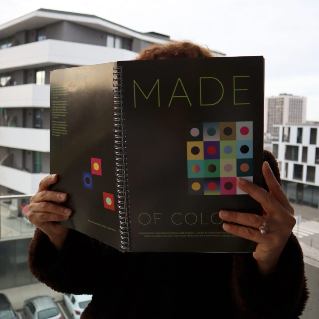
Made of Colour
Editorial · Experimental
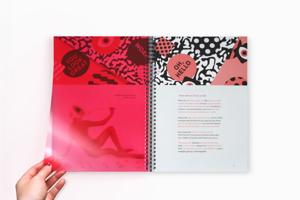
Made of Colour is a self-initiated editorial design project that explores how colour can function as a structural and narrative element, rather than a purely decorative one.
The project investigates how colour, contrast and rhythm shape visual perception, hierarchy and emotional response, using composition and typographic balance to construct meaning across expressive layouts.
How can design help overcome the common fear of using colour boldly?
Concept
Colour is treated as a guiding force within the design process — organising space, directing attention and setting tone. Through controlled experimentation, the project explores how visual rhythm and contrast influence storytelling and the way information is experienced.
Audience
Designers, creatives and visual thinkers interested in colour theory, emotional design and visual systems, particularly within editorial and conceptual contexts.
Outcome
The outcome consists of a series of editorial compositions that explore colour relationships, spatial tension and typographic hierarchy. Each piece conveys a distinct emotional atmosphere, demonstrating how colour decisions can guide narrative, structure information and create visual rhythm.
This project reflects my ongoing interest in colour as a communicative tool, reinforcing my approach to design as a balance between intuition, structure and clarity.